How to Apply Timeless Principles with CG Hunter Décor
Why Design Principles Matter
Interior design is more than arranging furniture; it’s the art of shaping balance, beauty, and comfort so a room both functions and feels right. According to Homes & Gardens, great rooms lean on time-tested principles that guide your choices and keep a space cohesive. When you understand these basics, it becomes simpler to make confident decisions—from choosing a rug size to placing a tree—so every detail contributes to an intentional whole. Below are the seven essentials many designers rely on, followed by real-world styling scenes using CG Hunter’s lifelike greenery and curated décor.
1) Balance

Balance is the distribution of visual weight. You can create it symmetrically (mirror-image placement), asymmetrically (different items that carry similar weight), or radially (elements arranged around a center). As Decorilla notes, a balanced room feels calm and resolved because no single side overwhelms the other.
2) Rhythm
Rhythm is movement for the eye—repetition, progression, and purposeful variation of shape, line, and color. When hues or forms echo across the room, the gaze flows naturally instead of stopping abruptly. The Spruce recommends repeating tones or materials at intervals—think brass appearing in two or three spots—to create a gentle visual cadence.
3) Emphasis

Emphasis gives the room a clear focal point: a sculptural tree, an art piece, a statement lantern. It’s the element guests notice first—the anchor that organizes everything else. Without emphasis, spaces can feel flat; with it, they gain purpose and direction.
4) Proportion & Scale
Proportion is the relationship between pieces; scale is how those pieces relate to the room itself. Sofas, tables, and greenery should look intentional in size—neither tiny nor overwhelming. Designers often start with the largest items (sofa, rug, or tree height) to set scale, then layer medium and small accents that are proportionate.
5) Contrast

Contrast adds energy and clarity by pairing opposites: light with dark, matte with gloss, curved with linear. Strategic contrast prevents monotony and helps the focal point stand out. Just a few well-placed contrasts can make a room feel more dynamic and thoughtfully composed.
6) Harmony & Unity
Harmony ensures everything belongs; unity weaves those pieces into a singular story. Repeating a palette, material, or silhouette builds harmony, while consistent styling across zones (entry, living, dining) promotes unity. Together they create that seamless, “of a piece” feeling.
7) Function

Function keeps beauty grounded in daily life. Traffic flow, surface height, lighting, and ease of care all matter. In busy homes, rentals, or second residences, choices that look refined and perform reliably—like maintenance-free faux greenery—support lasting comfort and style.
Scenes That Put the Principles to Work
Entry Moment: Welcome, Balance, and Emphasis
Begin with proportion and function: choose a rug size that frames the threshold and allows doors to glide freely. Add a slender table for keys and a sculptural focal point to set the tone—this is where emphasis and balance collaborate. A tall, lifelike tree establishes vertical presence while a warm metallic accent creates a counterpoint, achieving asymmetrical balance. For rhythm and unity, repeat one finish—such as brass or black—again in a nearby vase or tray so the look feels purposeful the instant you step inside.
Living Room Conversation Zone: Rhythm, Contrast, and Scale
In a seating arrangement, scale starts with the rug and sofa; then add a tree that matches the room’s height so the composition feels proportionate. Build rhythm by echoing materials at measured intervals: a hammered glass vase on one side of the room, etched glass on the other; a hint of brass repeated in a lantern and a side table. For contrast, pair a textured natural fiber rug with sleek metal accents, or set lush greenery against minimalist lines to keep the space lively yet cohesive. The result is a room that encourages conversation and photographs beautifully from every angle.
Dining Area: Harmony, Flow, and Focal Height
A dining setting benefits from a clear focal height at the center—low enough for eye contact, high enough to feel intentional. Choose a centerpiece that introduces texture without blocking sightlines. Rhythm comes from repeating tones across linens, glass, and greenery, guiding the eye around the table. Maintain function by leaving comfortable elbow room and ensuring traffic flow around chairs remains open. A few well-placed candles or lanterns add a subtle glow that supports harmony without overwhelming the scene.
Primary Suite Retreat: Proportion, Calm, and Unified Materials

For a restful suite, unify materials—ceramic, glass, or metal—so the bedside and dresser feel connected. Keep scale in check with a tree or arrangement that complements ceiling height and bed proportions rather than competing with them. Contrast can be gentle here: soft textiles against a sleek vessel, deep greenery against a neutral wall. Emphasis might be a single sculptural piece near a reading chair; rhythm might be the repeated hint of brass or black across two or three points in the room.
Guest Room or Office Nook: Flexible Harmony
Guest zones benefit from adaptable pieces and simple palettes. Aim for harmony by repeating one or two finishes; set a clear focal point to avoid visual clutter. Scale matters in compact spaces—choose greenery with a slimmer footprint and use trays or small tables to corral essentials, keeping traffic paths open. Rhythm can be as subtle as the same metal echoing across a frame, a vase, and a lantern.
Outdoor Terrace or Sunroom: Contrast and Durability
Exterior or transitional areas gain clarity from contrast: woven textures beside refined metals, soft textiles beside structured greenery. Proportion is crucial—larger containers often look best outdoors, grounding lounge furniture and framing views. Function rules here as well: weather-resilient materials and no-care greenery ensure the space looks consistently polished between gatherings, vacations, and seasonal shifts.
Use Your Imagination: Styling Tableaux with CG Hunter Décor (Applied Examples)
Example 1
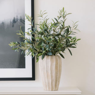
A layered living tableau might begin with the Natural Round Braided Jute Rug to establish scale and texture, then introduce a slim side surface like the Antique Brass Aluminum Accent Table for functional balance near seating. For rhythm and subtle contrast, pair etched and hammered glass—try the Etched Glass Tall Vases & Candleholders on a console and the Hammered Glass Vase in Smoke on a coffee table—so the eye travels around the room. Add a lifelike tree for emphasis and vertical proportion.
Example 2

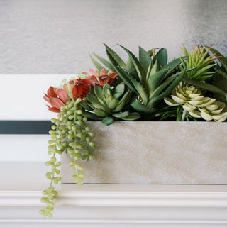
In a dining setting, create harmony by repeating a botanical motif across textiles: the Eggplant and Grey Roses Tablecloth and matching Napkins set a rich palette that complements greenery. Keep the centerpiece at conversation height and introduce a refined metal accent—the Decorative Aluminum Serving Tray—to provide contrast against natural fibers and wood. For quiet corners and consoles, vary scale and silhouette: place the 11" Black Terracotta Vase beside the Jaipur Curve Metal Container to mix matte and metallic finishes. In cooler months, tuck the 36" Artificial Pine Stem with Pinecones into a vessel to bring seasonal texture, and consider a compact succulent arrangement or a slim faux tree to keep pathways clear while maintaining visual weight.
Example 3
For patios, sunrooms, or breezeways, a lantern’s ambient light, a durable tray for entertaining, and a tall, true-to-life tree deliver contrast and function in one sweep—well-scaled pieces that keep the scene tidy, welcoming, and consistent from one weekend to the next. Complete the composition with a warm metallic glow from the Brass Lantern.
Final Thoughts and Call to Action

When you design with principles—balance, rhythm, emphasis, proportion and scale, contrast, harmony and unity, and function—every choice becomes easier and every room feels more resolved. CG Hunter’s lifelike greenery and refined décor offer the textures, silhouettes, and finishes that make these ideas effortless to apply, whether you’re styling a full living area or refreshing a quiet reading spot. For more ideas and beautifully styled spaces, explore our daily inspiration on Instagram, discover mood-forward boards on Pinterest, and see quick styling tips on TikTok. Designers and retailers can source directly through Faire. Share your finished rooms with #CGHunter—we can’t wait to see how you bring these principles to life.