Decor That Feels Intentional Long After the Day Has Passed
Valentine’s decor doesn’t have to disappear on February 15th. When approached with restraint, neutral foundations, and purposeful accents, Valentine’s styling can transition seamlessly into everyday home decor rather than feeling like a temporary display. The most enduring Valentine’s moments aren’t built around novelty or excess, but around intention—using red as a considered accent rather than a dominant theme, and grounding it in blush, cream, and natural textures. This allows spaces to feel romantic in the moment and effortlessly intentional long after the holiday has passed.
There’s a prevailing assumption that Valentine’s Day decor requires a short-term commitment: something brought out for a week or two, then packed away once the calendar turns. But that way of thinking treats the holiday as a theme rather than a feeling. When you shift the focus from decorating for Valentine’s Day to designing with warmth, contrast, and balance, the result is decor that doesn’t announce itself as seasonal. It simply supports the space year-round, and adapts quietly as small details change.
Reframing Valentine's Day at Home

Valentine's Day has long been associated with a specific aesthetic: pink hearts, red foil, sentimental tchotchkes that announce their purpose from across the room. But for those who prefer homes that feel considered rather than costumed, this approach misses the mark.
The holiday itself isn't the problem. The problem is treating it like a theme party instead of a moment worth marking. When you strip away the commercial veneer, Valentine's Day is simply an opportunity to celebrate beauty, warmth, and intention—all things a well-designed home should embody year-round.
The question becomes: how do you acknowledge the day without decorating for it? The answer is simpler than it seems. You focus on elements that carry emotional weight without seasonal baggage. You let color do the work, not kitsch. And you build around pieces that would feel just as thoughtful in March as they do in early February.
This isn't about rejecting Valentine's Day. It's about refusing to let it dictate your aesthetic.
Why Subtle Romance Is a Design Trend Right Now
This shift toward more thoughtful, lasting expressions of warmth is part of a broader design conversation happening right now. Elle Decor identified “cozymaxxing” as a defining interior trend for 2026. This approach prioritizes layered texture, comfort, and emotional ease over anything overtly seasonal or performative. Similarly, Vogue’s overview of 2026 interior design trends points to a growing preference for homes that feel personal, lived-in, and emotionally resonant rather than styled around fleeting moments. Together, these perspectives reinforce the idea that marking occasions like Valentine’s Day doesn’t require themed decor. Instead of focusing on the commercialism, cultivate a softer, romantic home intentionally for this season and beyond.
All About Red (Without Decorating in Red)
Red is the most emotionally charged color in the spectrum. It commands attention, signals warmth, and carries centuries of symbolic weight. But in home decor, red is also polarizing. Too much, and a space feels overwrought. Too little, and the gesture disappears.
The solution isn't to avoid red. Rather, use it sparingly and with conviction. Many designers approach Valentine's decor without red as a dominant palette, instead using it as a carefully placed accent that carries emotional weight without overwhelming the space.
Designers know that red works best when it has something to resist. A single stem of red roses in a clear bud vase reads as deliberate. A room full of red accents reads as uncertain. The former feels like a choice. The latter feels like a theme.
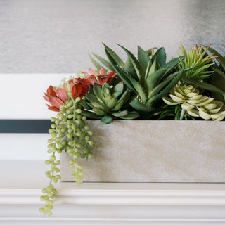
For Valentine's decor that doesn't expire after February, red should appear once or twice per surface (never more). A trio of red or pink-red roses on a console. A single heart-shaped cookie with a red center on a neutral pedestal. A linen napkin with subtle red tones folded beside a cream tablecloth. These are gestures, not statements.
What makes them work is contrast. Red gains power when surrounded by calm. It becomes a focal point rather than a pattern. And critically, it doesn't need to be explained or justified once the holiday passes. A red rose in March is still beautiful. A room full of red hearts in March is a miscalculation.
The key is to let red carry the emotional resonance of the moment without asking it to define the entire space.
Neutrals That Make Red Pop

This is where foundation becomes critical. Valentine's decor that transitions seamlessly after February requires a neutral palette sophisticated enough to support color without competing with it.
Blush serves as the bridge. Neither red nor beige, it softens the intensity of deeper tones while maintaining warmth. A blush linen tablecloth or napkin set creates a tonal relationship with red florals or desserts without feeling explicitly romantic. It's close enough to the Valentine's palette to feel intentional, but soft enough to remain versatile.
Cream and soft white provide contrast. They give red a surface to push against, creating visual tension that feels dynamic rather than flat. A cream-toned backdrop makes red feel more saturated, more intentional, more considered. Without that contrast, red can read as muddy or overwhelming.
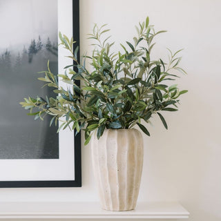
Clear glass and lightly tinted glass amplify color without adding weight. Bud vases in soft peach or pale yellow tones allow florals to remain the focal point while introducing subtle warmth. They're functional, understated, and entirely at home in any season. A set of assorted yellow and peach glass bud vases offers this flexibility—neutral enough to support spring blooms in April, but warm enough to harmonize with red roses in early February.
The blush lilies tablecloth and matching napkins exemplify this approach (also available as a set). The pattern is botanical, not seasonal. The color is soft, not sentimental. Paired with red accents, it reads as Valentine's. Paired with greenery or spring florals, it reads as simply elegant.
This is the foundation that allows Valentine's decor to remain in place long after the holiday ends. The neutrals aren't supporting actors—they're the structure that makes everything else possible.
Small Valentine's Moments That Still Work in March
The most effective Valentine's decor doesn't announce itself. It appears in small, deliberate moments that feel personal rather than performative.
A single bud vase with one or two red roses on a nightstand. A small dessert displayed on an aluminum cake pedestal in the kitchen. A linen napkin folded beside a breakfast plate. These gestures acknowledge the day without requiring a full staging.
What makes them work is scale. They're intimate rather than grand, specific rather than sweeping. And crucially, they don't depend on Valentine's Day to feel appropriate. A bud vase with roses transitions effortlessly into tulips or ranunculus. A cake pedestal becomes a display for baked goods. A linen napkin remains a linen napkin (or perhaps you'll shape it like a bunny for Easter and spring).
The same principle applies to dessert styling. A heart-shaped cookie with a red center feels playful in early February, but placed on a simple pedestal with neutral surroundings, it doesn't read as themed—it reads as thoughtful. By mid-February, the cookie is gone, but the pedestal remains, supporting whatever comes next.
This approach mirrors the way designers think about seasonal decor more broadly: the foundation stays constant, while the details shift. Nothing is single-use. Nothing feels disposable. And nothing requires justification once the calendar turns.
Valentine's Decor That Transitions Seamlessly

The test of good Valentine's decor is whether it requires explanation after February 14th. If a guest walks into your home in late February and asks why you're still decorated for Valentine's Day, something has gone wrong.
Here's what stays: the linens, the vases, the pedestals, the soft color palette, the overall sense of warmth and refinement. These elements don't belong to Valentine's Day—they belong to your home. They simply happen to support the holiday when called upon.
Here's what subtly changes: the red roses become white or blush-toned. The heart-shaped cookies are replaced by seasonal fruit or a simple cake. The napkins, which felt romantic in early February, now feel like part of a spring table setting.
The difference between these two categories is intention. The pieces that stay are versatile, understated, and rooted in quality. The pieces that change are ephemeral, specific, and meant to be enjoyed in the moment.
This is the distinction that separates temporary decor from lasting design. Temporary decor serves a single purpose and becomes irrelevant once that purpose is fulfilled. Lasting design serves the home first and adapts to the moment second.
For those who've previously approached Valentine's Day as a full dining experience—perhaps along the lines of Table for Two: A Valentine's—this approach offers a quieter alternative. It's less about setting a scene and more about acknowledging a moment. Less formal, more livable, and entirely suited to the everyday rhythms of a thoughtfully kept home.
Similarly, while Meaningful Valentine's Day Gifts Under $100 focuses on what you give, this approach focuses on what you keep. The two aren't mutually exclusive, but they occupy different roles. One is outward-facing. The other is inward, personal, and grounded in how you choose to live.
Designer Answers: Valentine's Decor That Lasts Beyond February
Can Valentine's decor be left out after February? Yes, when it's built on a neutral foundation with red used sparingly as an accent. Pieces like blush linens, clear glass vases, and simple pedestals don't belong to the holiday—they simply support it. Remove the red florals or heart-shaped desserts, and what remains is a refined, everyday setting. See our Valentine's Edit for further inspiration.
How do you decorate for Valentine's Day without it feeling themed? Focus on restraint and intention. Use one or two red accents per surface—a single rose, a small dessert with a red center—and surround them with neutrals like cream, blush, or soft white. Avoid hearts, novelty items, or anything that announces the holiday. The goal is to mark the moment, not costume the space.
How do designers use red for Valentine's decor? Red is most effective as punctuation, not palette. Designers place it sparingly—one bud vase, one dessert, one textile detail—and rely on contrast with neutrals to give it impact. Too much red overwhelms. A single gesture carries more emotional weight and remains beautiful long after the holiday.
What colors work best with red in home decor? Blush bridges the gap between red and neutral, softening intensity while maintaining warmth. Cream and soft white provide contrast, making red feel more saturated and deliberate. Clear or lightly tinted glass in peach or yellow tones supports red florals without competing, creating a cohesive palette that transitions easily into spring.
The Case for Subtlety

There's a reason designers rarely decorate in red. It's not because red lacks beauty—it's because red demands balance. It requires the kind of restraint that only comes from understanding how color, light, and form interact within a space.
Valentine's decor that works after February is Valentine's decor that respects this balance. It uses red as a tool, not a palette. It leans on neutrals to create breathing room. It favors quality over quantity, gesture over spectacle, and intention over tradition.
Most importantly, it acknowledges that the line between holiday decor and everyday design is thinner than we've been led to believe. The same principles that make a home feel considered in October—restraint, cohesion, thoughtful editing—apply in February. The holiday is simply an opportunity to lean into warmth and color in ways that feel seasonally appropriate without being seasonally dependent.
The result is a home that doesn't shift dramatically from one month to the next, but rather evolves in subtle, deliberate ways. A home that can acknowledge Valentine's Day without being defined by it. A home that feels intentional, not staged.
That's the kind of Valentine's decor worth leaving out after February.
Continue the Design Story
Discover more refined pieces for creating moments that last beyond the occasion throughout the CG Hunter collection, and continue the conversation by following @CGHunterHome on Instagram, Pinterest, TikTok, and on Substack for daily inspiration rooted in restraint, intention, and timeless beauty. For wholesale partners and designers, CG Hunter is also available on FAIRE.