Inside a Nashville Photoshoot at a Home Apartment Therapy Featured Years Ago
Every photoshoot reveals what a brand actually believes about design. We spent several days in Nashville this spring shooting our latest Hunter Collection alongside select Maxwell + Sienna pieces, and the rooms that came together had nothing in common with the over-styled vignettes saturating Pinterest right now. They were darker. Quieter. More layered. The faux greenery did not sit on top of the rooms. It became part of their structure.
The house is owned by Tara Steffen, our Marketing and Sales Manager, and was featured by Apartment Therapy for its eclectic, collected approach. That detail mattered. We were not building a styled set. We were placing pieces inside a home that had already proven the argument we wanted to make.
Why We Chose This Home for the Shoot

The house is a mid-century build with classic lines, gallery walls, and rooms shaped by years of estate sale finds, European flea market hauls, and inherited pieces. Tara travels Europe regularly for work and brings home objects that other people would never put together, then puts them together. The result is a home that reads as collected over time, because it was.
Faux greenery and florals tested in a styled white-box studio prove almost nothing. The same products tested in a real home, with real light shifting across them through real windows, prove how they will actually live in the spaces our customers occupy. Tara's home gave us walls with history, rugs with wear, and surfaces with marks. The greenery had to earn its place inside that.
What happens in a layered room is instructive. Greenery reads as a structural element, not a decorative afterthought. A faux tree against deep shiplap behaves like architecture. A single white orchid against the same wall reads as punctuation. Contrast does more work than abundance.
The Faux Tree as Architecture, Not Accent
The single most repeated lesson across the shoot was about scale. A small faux tree placed in a large room reads as decoration. A correctly scaled tree, placed in conversation with the height of the room and the weight of the furniture beside it, reads as architecture. The 7.5' Faux Shady Lady Tree in Pot we styled at the entry sat inside a deep cylindrical planter and reached toward a piece of original artwork above a marble-topped lyre console. The branches did not fill the wall. They framed it.
The Shady Lady is a Maxwell + Sienna piece, originally designed for hospitality projects where a tree has to hold its presence year-round and look correct from every angle. That bar is the reason it works in a residential entry. Most homes do not need more greenery. They need greenery that has been considered as carefully as the lighting plan or the rug.
Lived-In Beats Styled, and the Photos Prove It

The shoot ran on a principle we keep returning to. Homes that look calm in photographs are not the same as homes that feel calm to occupy. We styled rooms the way someone might actually leave them on a Tuesday morning, with stacked design books, a worn antique rug, a vintage Victorian armchair pulled up to a marble-topped lyre console, and a single 22" Artificial White Phalaenopsis Orchid placed where a real one would naturally sit.
The result reads as collected over time, not curated for a camera. That is what most of our customers are trying to achieve in their own homes, and it is what our products are designed to support. A faux tree only earns its place when it looks like it has been there longer than the furniture around it.
Vintage Furniture, Faux Florals, and Why the Pairing Works
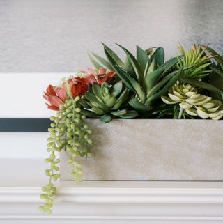
Tara's home leans into a kind of relaxed eclectic mix that depends on real provenance. A leopard-print Victorian armchair. A lyre-base console with a marble top. Brass swans, antique brick, framed still life paintings layered against shiplap, gallery walls full of European etchings and inherited silhouettes. The faux florals had to earn a place inside that visual density.
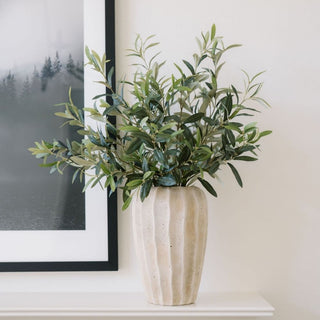
What worked were the pieces that mimicked seasonal stems someone might actually cut and bring inside. 26" Artificial Blue Thistle Stems in a stoneware pitcher beside a farmhouse sink. 35" Light Green Artificial Hydrangea Stems layered into an aged ceramic vessel beside an oil still life. 48" Faux Fig Branches with Fruit arched out of a 15.5" Alessia Decorative Vase in front of a window, the deep olive glaze grounding the foliage against the brick. 31" Artificial Watermelon Poppy Stems brought a pop of saturated color into a quieter corner. Each one read as something brought in from outside, not arranged for display.
This is where the cousin brand earns its keep. Maxwell + Sienna pieces hold up in rooms with real material weight because they are designed for designers, hospitality buyers, and architects who specify pieces for projects that have to last. They were built for spaces that already have a point of view.
Topiaries, Wreaths, and the Architecture of an Entrance

One of the most photographed corners of the shoot was the front porch, where layered 36" Double Boxwood Topiaries in Pot sat in terracotta on the brick steps beside a stone sheep statue. An oversized 30" Artificial Boxwood Wreath draped against the back of an outdoor settee upholstered in the same leopard print that runs through the house. The wreath was not on the door. It was at rest, the way a piece of architectural greenery might sit when it has not been put away yet.
The lesson is that topiaries and wreaths do not have to follow the rules they came with. A wreath can be sculpture. A topiary can act as a column. Greenery placed with this kind of intention does what live plants cannot, which is hold its position year-round without seasonal storage or replacement.
How a Single Stem Can Hold an Entire Vignette
The smallest moment in the entire shoot may have been the most instructive. A single 22" Artificial White Phalaenopsis Orchid, in a weathered stone pot, on a marble surface, against charcoal shiplap, beside a stack of design monographs. Nothing else. The image read as one of the strongest from the day.
This is the discipline most rooms are missing. A vignette does not need three coordinated pieces. It needs one piece chosen well, placed where the light and the surfaces will do the rest of the work. Restraint photographs better than abundance because the eye has somewhere to land.
Designer Answers

Q: Why use faux greenery instead of live plants in a styled home?
A: Faux greenery holds its appearance year-round without watering, light requirements, or seasonal replacement, which makes it more reliable for design-led spaces where consistency matters more than horticultural authenticity.
Q: How do you make faux trees and florals look realistic in photos?
A: Scale and placement carry more weight than the product itself. A correctly sized faux tree placed in conversation with the surrounding architecture reads as natural. An undersized one placed as filler always reads as faux.
Q: What kind of room benefits most from faux greenery?
A: Layered, vintage, and darker rooms benefit the most because greenery acts as a structural counterpoint to heavy furniture and saturated walls, while live plants often struggle in low-light spaces of this kind.
Q: Can faux orchids and florals work in formal vignettes?
A: Yes, particularly when paired with weathered or aged vessels rather than glossy ceramic. A single faux phalaenopsis orchid in a stone or terracotta pot reads as restrained and architectural.
Q: What is the Maxwell + Sienna line, and how is it different from CG Hunter?
A: Maxwell + Sienna is CG Hunter's trade-focused sub-brand, designed for architects, interior designers, and boutique hospitality projects that require ultra-refined botanicals built for permanence.
Behind the Scenes on Social: What the Camera Confirmed
The strongest rooms from Nashville shared one quality. Every piece in them had a reason to be there. Faux greenery, vintage furniture, layered art, antique brass, and stone all earned their placement. Nothing was decoration. Everything was infrastructure. That is the standard the Hunter Collection and Maxwell + Sienna are built to meet, and it is the principle the Designer Journal exists to defend. For more on the design thinking behind the shoot, follow along on the Designer Journal, our weekly Substack, and @cghunterhome on Instagram, Pinterest, and TikTok.